Spotify — A redesign that gave music its feeling back
An app that knows
what I listen to. Not who I am.
This is a solo Spotify redesign built during Ironhack's UX/UI bootcamp, working from a personal starting point: chromesthesia, my own ability to see color in music. I ran the full heuristic and competitive analysis myself, then built the fix around that condition, a genre-and-mood color system that runs through the whole interface. Across a Nielsen evaluation and a design critique, the app moved from an unclosable mini-player, a chaotic library, and unreadable icons to a version validated by peers and delivered as a working Figma prototype.
Spotify knows my playlists, my habits, my most played genres.
It knows nothing about how I actually perceive music.
Spotify wasn't my first choice. I'm genuinely grateful it became the project.
The brief was open: redesign an app of my own choosing. I almost picked LinkedIn instead.
When I got the assignment to redesign an app of my own choosing, I was originally set on LinkedIn. A change in circumstances made me reconsider, and looking back, I'm glad it did. I had a lukewarm relationship with Spotify: I don't enjoy using it myself, it feels heavy, cluttered, and impersonal, while music itself is something I love and carry with me every day. The brief gave me complete freedom, and it opened the door to using something I'd never considered a design tool before: chromesthesia, my ability to see color in music.
Three things that don't work in Spotify.
A gut feeling points at what might be wrong. It isn't proof of what actually needs fixing.
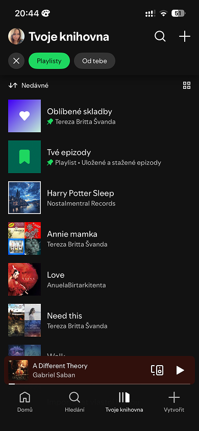
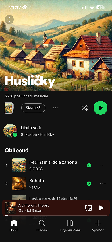
Before designing anything new, I needed to be clear on what was actually broken. So I ran the app through Nielsen's heuristics and picked the three most significant problems from the full analysis: the mini-player can't be closed, even when the user wants a clean, distraction-free screen; playlists, saved episodes, and albums are mixed into one feed with no clear distinction between them; and green checkmarks and raw play-count numbers force the user to guess what they mean instead of recognizing them instantly.
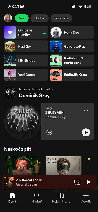
User control and freedom
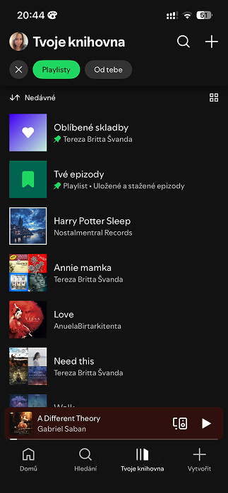
Aesthetic and minimalist design
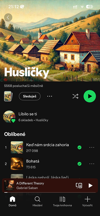
Recognition rather than recall
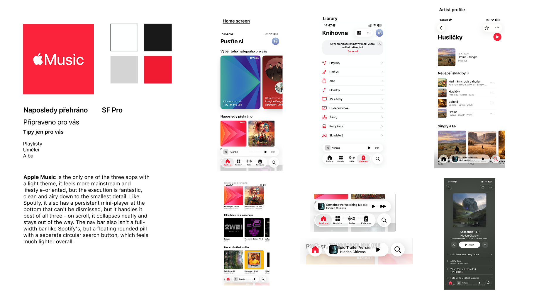
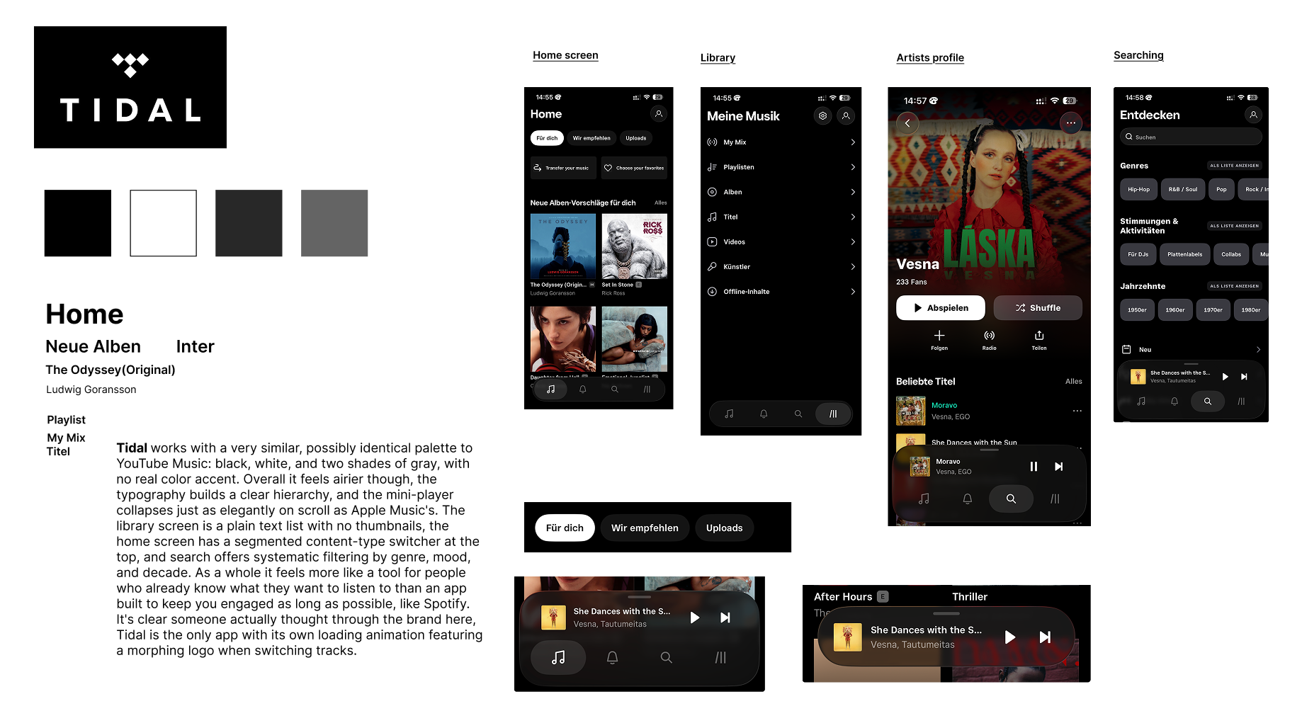
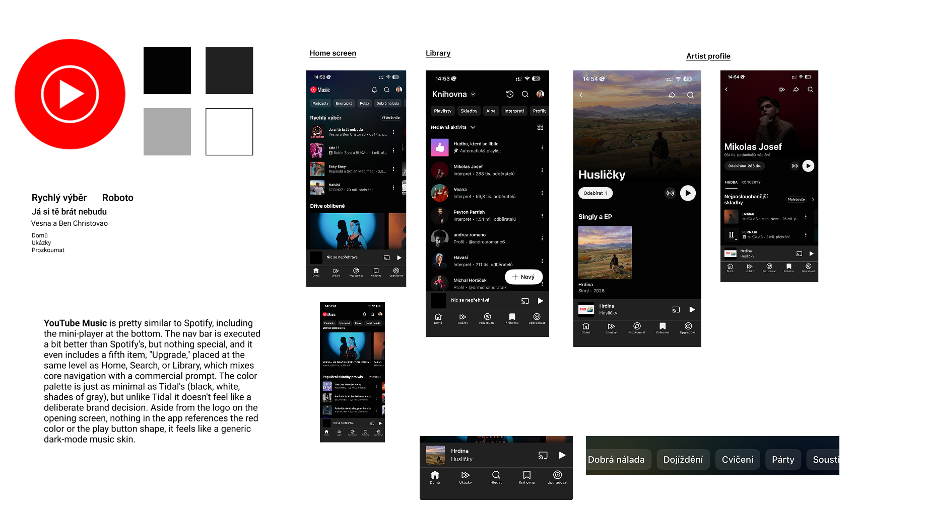
I wanted to know whether this was a Spotify problem or an industry-wide one, so I ran the same comparison across Apple Music, Tidal, and YouTube Music. Apple Music handles the mini-player best of the three: on scroll it collapses neatly instead of just sitting there, and its floating pill-shaped nav bar feels lighter than Spotify's full-width one. Tidal and YouTube Music share almost the same palette, black, white, and two shades of gray, but only one of them uses it on purpose. Tidal builds a clear typographic hierarchy and even has its own loading animation, a morphing logo between tracks, while YouTube Music's grayscale reads as a default dark-mode skin nobody designed on purpose, and its nav bar mixes real navigation with a commercial "Upgrade" button. None of the four apps, Spotify included, let color carry any emotional information.
What if color wasn't just decoration?
The heuristic analysis showed what was broken. It said nothing about how to fix it.
The answer turned out to be something entirely natural to me: chromesthesia, a form of synesthesia where hearing music automatically triggers a perception of color. For me, music and color have never been two separate things. It sounded like an interesting creative concept, but a real obstacle stood in the way: how do you turn something so deeply subjective into a system that works for people who perceive the world completely differently?
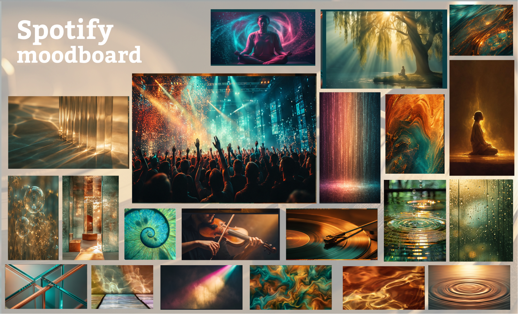
The solution wasn't to transplant my own perceptions into the interface word for word. I only borrowed the underlying principle: every major genre got one fixed color, rock, electronic, pop, hip-hop, jazz/soul, and classical, each with its own visual tone. The interface shows how a given kind of music feels, in a way that's legible to everyone. This same foundation later gave rise to filtering music by mood. I ultimately framed the whole system around four core attributes. Whatever the user is listening to, the app had to feel clear, calm, expressive, and above all, like their own personal, safe place.
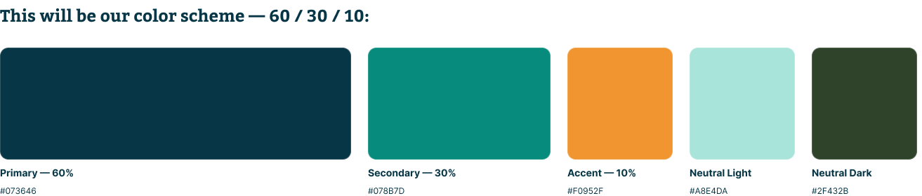
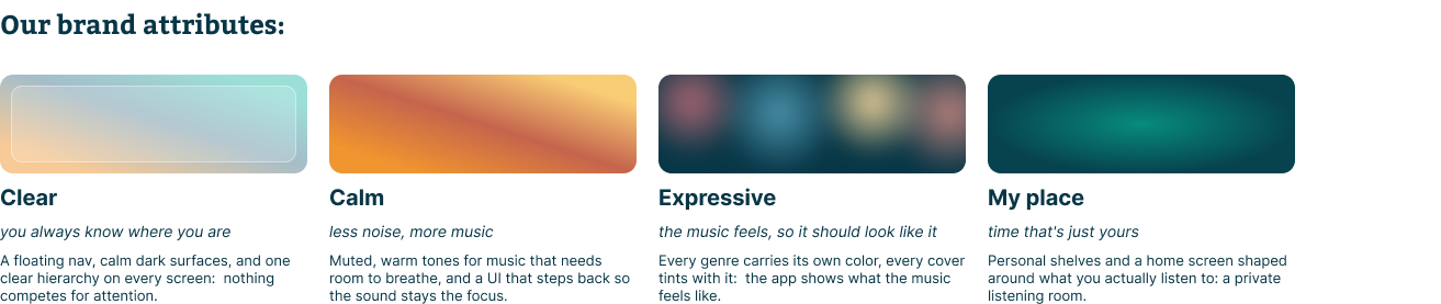
A personal concept
that has to work for everyone.
My first instinct was to let users turn the mini-player off completely. Comparing Apple Music and Tidal proved that instinct wrong.
It turned out users actually rely on the mini-player while listening and don't want to lose it entirely. I kept the option to dismiss it, but the main solution was different: shrinking it and letting it merge into the bottom tab bar.
This same habit of questioning my own assumptions carried through into the structure of the home screen. To stay on course, I used the four pillars, clear, calm, expressive, personal, as a filter for every further UX decision. The goal was an arrangement and set of filters that felt more personal than a plain music catalog. The result is a space where the user's current mood is reflected directly in the interface's colors, gently accompanying them as they listen and browse.
A home screen that asks how you feel, not what you own.
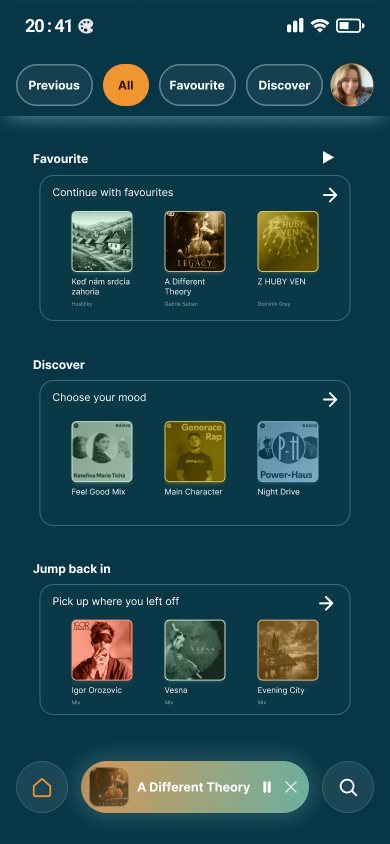
Instead of splitting by content type, I filtered by the user's relationship to it: Previous, All, Favourite, Discover.
The Discover section makes direct use of the color system: the "Choose your mood" tiles offer specific moods, Feel Good Mix, Main Character, Night Drive, each in the color that matches its genre. The user picks a playlist based on how they want to feel, not on an artist's name.
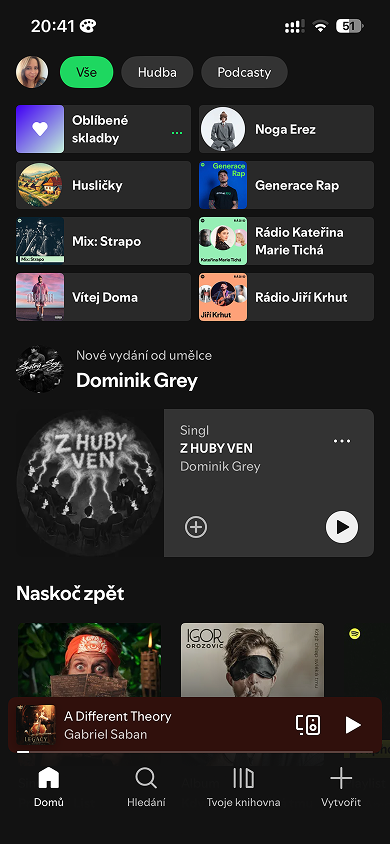
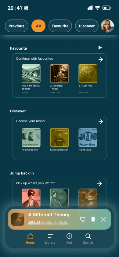
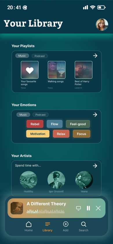
A library that stopped being one endless list. The library mixed playlists, saved episodes, and albums into one feed with nothing to tell them apart. I split the content into three clear sections: Your Playlists, Your Emotions, Your Artists. Your Emotions is a direct result of the color system, moods like Rebel, Flow, Feel-good, Motivation, Relax, Focus are color-coded using the same logic as the genres on the home screen. The result is a library you can scan in a few seconds, instead of scrolling through an undifferentiated list.
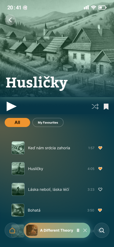
One button, one arrow, one clearer signal.
I presented the redesign in a design critique with classmates and a mentor. The feedback confirmed the direction I'd chosen.
The one concrete change concerned a single detail on the first screen: moving the play button to the top and adding an arrow to open the full playlist, so it's immediately clear that playing it starts the whole playlist, not a single track.
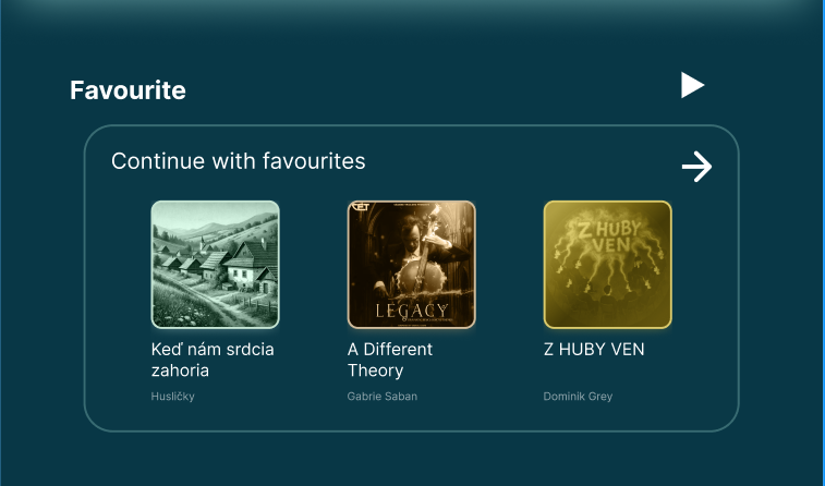
The rest of the feedback confirmed that the solutions were working. One comment noted that the redesign removed the app's crowded feeling. Another highlighted how tying the interface's look to the mood and vibe of the music made the experience feel more accurate and relevant.
Where AI helped, and where I didn't let it decide.
AI only knows what I feed it, so its output inherently carries my own biases and assumptions.
I used AI tools for the moodboard, after first building a version by hand. I ran several iterations and fed my own hand-built moodboard back in as reference material to sharpen the results. I selected from those iterations myself, I didn't accept the output as-is. I checked every result against my own judgment before including anything in the final version.
I knew when to stop.
Next time, I'd let the app
breathe a little more.
Two things this project taught me the most: how long to trust a quick judgment, and when to stop adding to a design that already works.
This was a solo project, so every decision from the heuristic analysis to the final screens was mine to make and mine to defend. The first lesson was about the mini-player: my initial instinct was quick, and comparing it against Apple Music and Tidal showed that even a fast judgment is worth putting through longer scrutiny. Without that competitive analysis, the app would have lost a feature users actually rely on.
The second was about scope. Right from the start, I had to be clear on what belonged in this redesign and what didn't. I knew the next logical steps would be a gentle pulse and glow in the mini-player synced to the playing music, and an accessibility layer for visually impaired users, so the app wouldn't rely on color as its only carrier of information. I chose to stay within the current scope instead, rather than risk finishing at a lower quality.
Usability testing wasn't part of the brief. In a more developed version, this project should go three steps further: real testing, micro-animations that would make the app feel more alive, and an accessibility layer independent of color.
You can explore the interactive prototype on Figma.