Enow — Acknowledge Now, Reset Later A stress app for parents with no time to sit down.
Enow is a stress-management app for parents of young children, built during Ironhack’s UX/UI bootcamp. My part covered the full visual identity, name, logo, and brand, plus the SOS flow and onboarding animations. Across three rounds of testing, the app moved from one confusing SOS screen to a system that triggers hands-free, through a lock-screen widget or by voice, and treats the moment of acute stress and the moment right after it as two separate conversations, each with its own tone.
Stress apps mostly assume you have time to sit down.
Reality is the opposite. When the pressure of the day spills over, there is no time to scroll through a long menu, and often no free hands for a phone either.
Enow is a mobile app we designed as a team for a fictional client, The Daily Health Conference.
The brief was open: build an app and a fresh visual identity around wellness.
We ran into a problem almost immediately: stress has no clean edges, it touches nearly everything a person does in a day, and trying to solve all of it would have produced nothing usable. Instead of a large catalog of relaxation techniques, we narrowed the scope to a single moment: the tipping point, when the pressure that built up all day spills over and a person needs relief right away, with no extra steps in between.
European data and real conversations pointed at the same thing.
Stress isn't the exception, it's the default state, and the apps on the market haven't caught up.
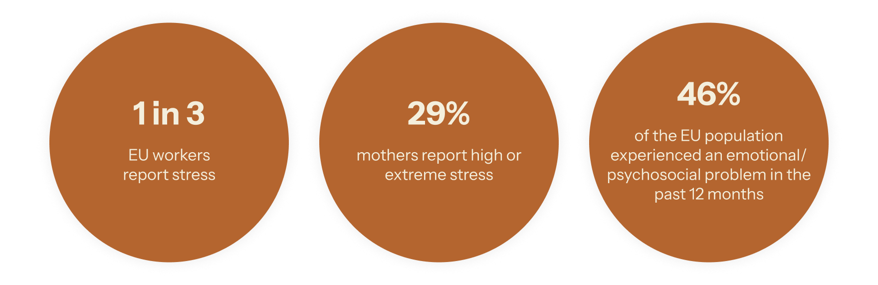
We worked from EU-OSHA and Eurofound data: one in three EU workers reports work-related stress, 29 percent of mothers report high or extreme stress, and 46 percent of the EU population went through an emotional or psychosocial problem in the past year.
What parents told us:The numbers gave us the scale of the problem. Five interviews with parents and caregivers gave it shape — the same idea kept resurfacing, worded differently each time.
"That moment, from the moment we start the evening routine, until everyone is asleep, is the most stressful part of my day."
"It should not have [that], because you're in a state of mind when you're stressed and you should not feel pressured."
It wasn't about speed. It was that the app couldn't become one more task on an already full list. Every coping mechanism people already used was physical and immediate: cold water on the face, counting to ten, a short walk. None of it involved opening an app.
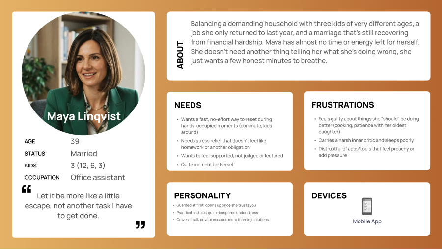
Maya doesn't need an app that explains anything to her.
She needs the certainty that when she's overloaded, there's a space where she doesn't have to prove anything to anyone.
Persona: Maya Linqvist, 39, office assistant, married, three kids of very different ages (12, 6, 3). She returned to work only a year ago, and the marriage is still recovering from a period of financial strain. Her day isn't about sudden swings — it's a predictable build-up of pressure. She already knows, by evening, that she'll hit a point where the tension becomes unbearable.
"Let it be more like a little escape, not another task I have to get done."
That single sentence became the filter for every decision after it. Not "what relaxation technique works best," but "what does not ask more of her, at the one moment she has nothing left to give."
The journey map produced dozens of HMW questions, one for nearly every step of Maya's day.
We couldn't build an app that answered all of them at once.
Mapping Maya's day — from quiet morning pressure through work, the slow climb toward evening, to the tipping point at bedtime — produced dozens of "How might we" questions. Three directions competed for the main flow, and all three made sense on their own: a system built around the SOS moment, a dashboard tracking her state over time, or a library of exercises to choose from.
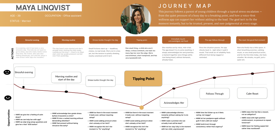
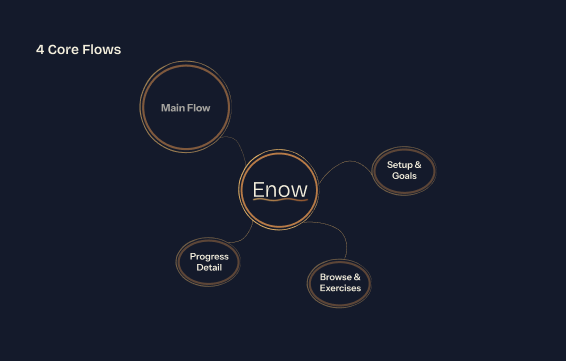
What decided it:We went back to Maya's tipping point. If that moment is the reason the app exists, the main flow had to be built around it, not around tracking, not around a menu. SOS became the primary path. Everything else — setup and goals, progress detail, browse and exercises — became separate modules built alongside it, connected later instead of competing for the center.
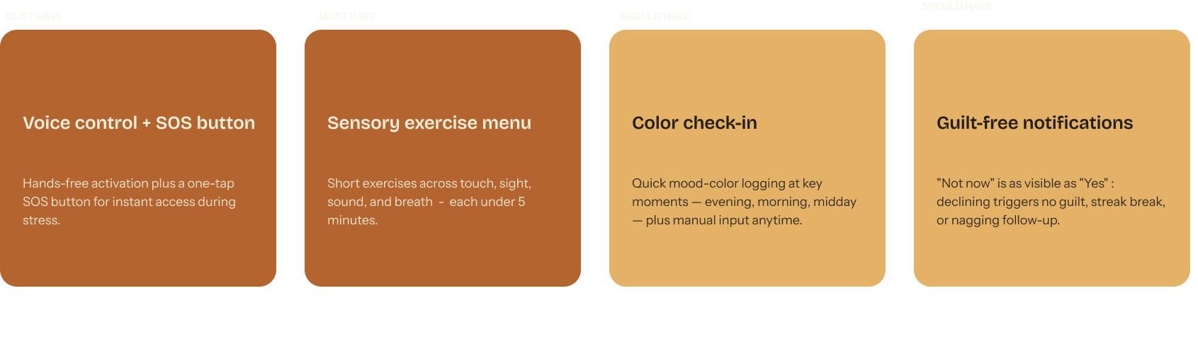
MoSCoW cut the scope without debate.
One sentence carried the whole decision, and stayed with the product from MVP on:
"Acknowledge now, reset later."
The app has to see and register Maya first. The return to calm comes after, never as a condition.
Color and typography had to carry the same idea as the product itself.
The app has no separate light and dark mode. It runs on one continuous brightness scale that responds to the user's state.
A visual audit of Headspace and Calm showed two different approaches: Headspace leans on warm colors and playful illustration, Calm on muted blues and nature photography. Neither adapts visually to an acute moment of stress, which left room for our own direction.
We chose terracotta and gold as a warm constant, paired with a deep navy for SOS and calming passages. Instead of switching between light and dark by time of day, we designed an adaptive brightness scale: the app darkens with the emotional intensity of the moment. Home stays lighter, the SOS interface moves into darker tones that strain the eyes and attention less.
For type, we picked Bricolage Grotesque in a light weight for headings, so the interface stays calm and never "shouts," paired with Instrument Sans for body text. The whole identity stayed inside five brand attributes: Calm, Confident, Empowering, Personal, Trustworthy.

We show the core idea of the app through two key screens.
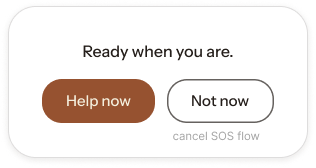
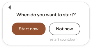
One starts the SOS mode, the other closes it once Maya has calmed down. Both hold the same rule: ask nothing of her.
We picked these two screens because they make the idea of the whole app clearest.
The first exists for the moment Maya triggers SOS, by voice or through the widget on her lock screen. The interface darkens immediately and offers just two direct choices: a quick presence exercise, or a countdown she set up beforehand. Once the countdown ends, the app checks in, without any urgency, on what should happen next. Maya can extend the time, move into an exercise, or close SOS mode entirely.
The second screen captures the moment right after the countdown: the return to calm. Here we worked from the same principle that runs through the whole app: the interface can't measure, score, or grade anything. All it needs to do is confirm that Maya is okay and give her a moment that's hers alone.
The same finding kept resurfacing across all three rounds of testing.
Numbers and charts made the app feel cold. We had to learn to let it feel, instead of measure.
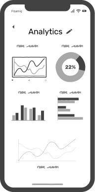
It first showed up between low-fidelity and mid-fidelity: the first dashboard was full of charts and percentages, exactly what we were trying to keep the app away from. We simplified it into clear sections that move from the user's current state toward detail, not the other way around.
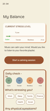
On the mid-fidelity prototype, tester Ambre surfaced the same finding from a different angle. Our stress-level slider ran on a 0 to 100 scale. Her reaction: people describe their state in colors, not numbers. "How many times did you feel red, how many times did you feel blue," as she put it, the same problem as the dashboard, in miniature: the app was measuring instead of listening. Mood colors used elsewhere in the app needed to hold everywhere, not just on some screens.
On the finished high-fidelity prototype, we ran desirability testing to see if that shift had landed. People described the app in a few words of their own choosing: Friendly, Secure, Easy to use, not "efficient" or "clear," the words apps usually chase, but words that describe someone you trust, not a tool that grades you.
My role: brand, developing the SOS flow, and the tone in the app's most sensitive moments.
What I take away from this project most isn't really about the design itself. It's about how we worked as a team.
I owned the full visual identity on this project: the name Enow, the logo, and the whole brand style. The first idea for voice control and a bottom SOS button came from my teammate, and I took it from there, building it out into the SOS flow, onboarding, and the animations you see here.
The biggest lesson came from how we organized as a team. We each work at a somewhat different pace, which isn't a problem on its own, but it demands more ongoing sharing and clearer rules from the start, for example around building and maintaining components in Figma.
Given more time, I would have spent it tightening the timing on the animations and finishing the remaining exercise screens inside the SOS flow.
You can find the full presentation and a click-through prototype linked at the top of this page.